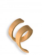

Critiques are your friend. They’re a valuable tool and if you fully appreciate critiques, they’ll push you to exhaust all options for a design. If you are not open to addressing critiques you limit yourself to just your opinion. No one cares about your opinion. There are so many other designers out there competing for the same jobs as you, it is important your designs translate the same way for everyone that sees them. After choosing a logo to run with, I started to collect my criticisms. One critique that I kept hearing was that a wooden logo may look like I’m a wood craftsman more than a designer. Some suggestions were to make it a flat vector logo, however than I lose my unique hands-on approach I was going for. I’d like to keep my logo as is but I need to explore other options to prove to myself that it is the best version it can be.
I found a great article about graphic design trends in 2016, I believe it is important to know trends so that you can either avoid them if they have become tired/cliché or try using them to your advantage since they are proven to be visually appealing. The article, The 5 Graphic Design Trends You Need To Be Aware Of In 2016, by Janie Kliever explores the current top trends, which helped me get started on exploring different ways of executing my logo.
-
“Modern” Retro Style
This is different than vintage design of the 1900-1960s, “modern” retro takes a modern approach to retro design taking inspiration from earlier centuries like the 1970-1990s. I attempted this style in a comp of my logo because I felt this style was a good representation of my “fun” design style.

-
Material Design
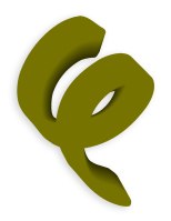
This trend comes from our good friend Google. To create a bold, graphic-look google created material design guidelines, which is a visual language characterized by “deliberate color choices, edge-to-edge imagery, large-scale typography, and intentional white space” according to google. Kliever suggests these guidelines are an update to the beloved flat design trend by just adding subtle effects for additional depth. I have always been a fan of flat logos so I definitely wanted to explore this trend with my personal identity. I believe this could be incorporated nicely on a matted material when printed.
-
Bright Bold Colors
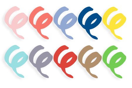
Taking from the 80s and 90s, vibrant hues are back in 2016. This is obvious from Pantone’s Spring 2016 Color Report. Using neon colors with other bright colors and a strong black for contrast can help make your designs really pop. I tried using these bright colors to test different color palettes with my logo to make sure I wasn’t constricting myself too much with sticking to a black and white identity.
-
Geometric Shapes
Geometric shapes will always be in trend, however a sweeping new trend we’ve been seeing in a lot of designs this year is called “low poly” which is making imagery with triangles. I choose not to attempt this approach because I enjoy the look of it but I worry it is already becoming a cliché through all my research.
-
Negative Space
This is probably my favorite trend in this article; Kliever explains the value of negative space for good design. If used correctly, it can be a clever way of creating a double meaning with your imagery. I created a logo using my negative space to create my initials, however I don’t believe it is strong enough to pursue me to steer away from my “swirl” logo.

